Transition 예제 (7)
<!DOCTYPE html>
<html lang="en">
<head>
<meta charset="UTF-8">
<meta name="viewport" content="width=device-width, initial-scale=1.0">
<title>Step02_Transform3.html</title>
<style>
.box{
width: 100px;
height: 100px;
border: 1px solid red;
cursor: pointer;
background-color: yellow;
transition: transform 0.4s ease-out; /* 나중에 천천히 */
}
.tran {
transform: translateX(50px) translateY(50px) rotate(45deg) scale(1.5);
}
</style>
</head>
<body>
<div class="container">
<h1>transform 테스트</h1>
<button id="resetBtn">리셋</button>
<div class="box"></div>
<div class="box"></div>
<div class="box"></div>
</div>
<script>
document.querySelectorAll(".box").forEach((item)=>{
item.addEventListener("click",(e)=>{
e.target.classList.add("tran");
})
})
document.querySelector("#resetBtn").addEventListener("click", ()=>{
document.querySelectorAll(".box").forEach((e)=>{
e.classList.remove("tran");
})
})
</script>
</body>
</html>
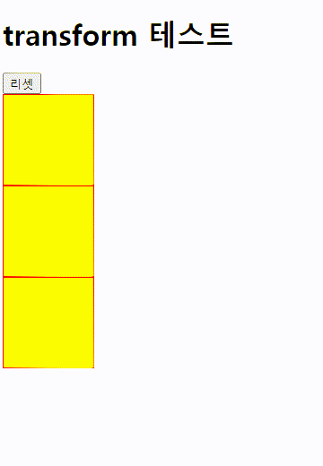
3개의 div 모두 translate 효과를 갖고 리셋버튼을 클릭하면 3개의 div 모두 원래 상태로 초기화된다.
웹브라우저 실행)
'CSS' 카테고리의 다른 글
| animation (2) (0) | 2023.07.13 |
|---|---|
| animation (1) (0) | 2023.07.13 |
| Transition (6) (0) | 2023.07.12 |
| Transition (5) (0) | 2023.07.12 |
| Transition (4) (0) | 2023.07.12 |


