animation 예제 (1)
<!DOCTYPE html>
<html lang="en">
<head>
<meta charset="UTF-8">
<meta name="viewport" content="width=device-width, initial-scale=1.0">
<title>Step03_Animation.html</title>
<style>
.round{
border: 1px solid red;
border-radius: 50%;
}
/* 페이지 로딩 시점에 한번만 수행된다 */
#kim {
animation: rotateAni 3s linear;
}
/* 마우스가 hover 될때 마다 수행된다 */
#kim2:hover {
/* animation: rotateAni 3s linear; */
animation-name: rotateAni;
animation-duration: 3s;
animation-timing-function: linear;
}
/*
rotate 클래스가 추가되는 시점에 수행된다.
추가 될때마다 여러번 수행하고 싶으면 애니메이션이
끝난 시점에 rotate 클래스를 제거 해 주어야 한다.
*/
.rotate {
animation: rotateAni 3s linear;
}
/* animation keyframe 정의하기 */
@keyframes rotateAni {
form {
background-color: #ffffff;
transform: rotate(0deg);
}
to {
background-color: #ff00ff;
transform: rotate(360deg);
}
}
</style>
</head>
<body>
<div class="container">
<h3>animation 테스트</h3>
<img class="round" id="kim" src="images/3.png">
<img class="round" id="kim2" src="images/3.png">
<img class="round" id="kim3" src="images/3.png">
<img class="round " id="kim4" src="images/3.png">
</div>
<script>
// #kim3 는 클릭했을때 rotateAni 라는 키프레임이 적용되도록 해 보세요.
document.querySelector("#kim3").addEventListener("click", (e)=>{
e.target.style.animation="rotateAni 3s linear";
})
document.querySelector("#kim4").addEventListener("click", (e)=>{
e.target.classList.add("rotate");
})
// animation 이 종료되면 animationend 라는 이벤트가 발생한다.
document.querySelector("#kim4").addEventListener("animationend", (e)=>{
// rotate 클래스를 제거하면 다음번에 추가 될때 animation 이 동작
e.target.classList.remove("rotate")
})
</script>
</body>
</html>
웹브라우저 실행)

새로고침 한경우에 바로 실행되는 div

마우스를 위에 올려놓으면 움직이는 div
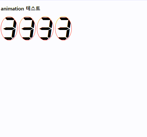
이미지를 클릭했을때 움직이는 div

이미지를 반복 클릭해도 움직이는 div
'CSS' 카테고리의 다른 글
| animation (3) (0) | 2023.07.16 |
|---|---|
| animation (2) (0) | 2023.07.13 |
| Transition (7) (0) | 2023.07.12 |
| Transition (6) (0) | 2023.07.12 |
| Transition (5) (0) | 2023.07.12 |


